Logo Design Process
These are the four major parts of the process
I go through when designing a logo.
After the proposal is accepted and 50% deposit paid, I’m sending the questionnaire and here is where I need the client to be as descriptive and as detailed as possible, so I can understand, to the best of my abilities, what the logo is intended for.
When I gather all the information, I start conducting my research, generating ideas, extracting the keywords for the brand and creating a mood-board that fits the design style the client wants.
Design is part of the process where real work starts and the end result is multiple logo concepts paired with different typography and colors. In between sketching, digitizing, and presentations are client feedback and revisions until we hit the final logo that we are both happy with.
After the final logo has been approved, I proceed to create source files for the web and print. I save the logo in multiple lockups and colors. Along with the source files, I create a PDF file that serves as the logo usage guide, where I show how to use the logo in different lockups and on different backgrounds and many more.
After the deep dive, the main part of the logo design starts. I am sharing the process that I have built over the last couple of years below.
BT®STUDIOS
A film production studio and a lifestyle brand.
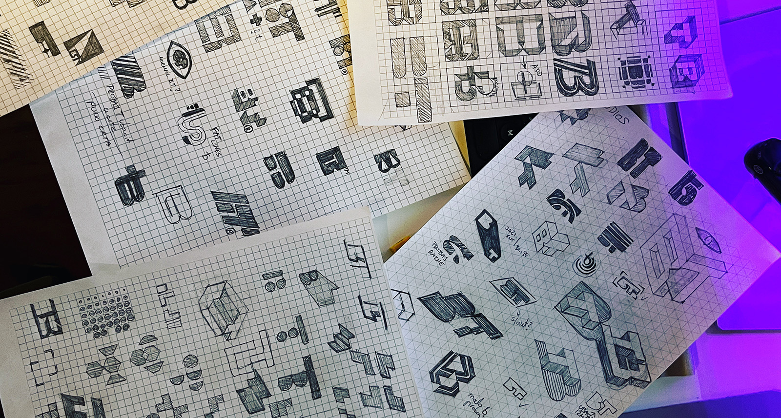
EVERY DESIGN STARTS WITH A SKETCH
This is my favorite part of the logo design process and in the end I usually have over 100 sketches. Sketches that are the best suited for the brief are going to be digitized on the computer.

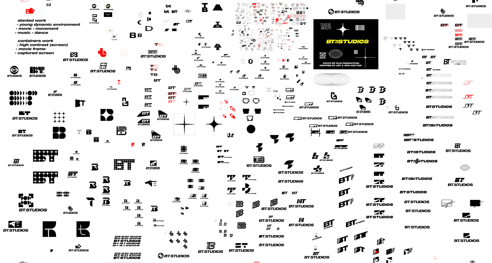
DIGITIZING
Taking the best sketches and digitizing them on the computer is the part of the process where the final direction is usually born. I’m creating numerous variations and in the end, I have final three or more concepts ready for presentation.

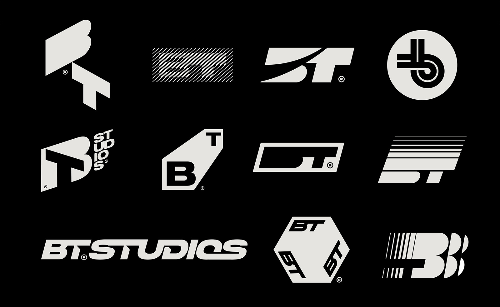
THE BEST CONCEPTS
The best concepts are chosen and prepared for presentation.

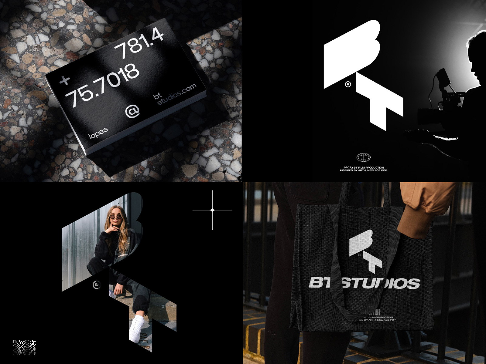
PRESENTATION
I present 3 or more directions and create a presentation in which I show the logo in various scenarios: logo in color version with the explanation and meaning behind it, logo in black and white, logo applications which help to better visualize how the logo might work in various contexts. And finally, logo in a different background. At the end of the presentation PDF, I put all the concepts together on the board to help the client in his decision.

FINAL DIRECTION
This is the stage in which we have a final direction and revised logo mark that is ready to be further developed. I usually reconstruct it using the grid or I just edit and reshape paths and remove unnecessary anchor points to get a perfect logo mark.
GRID
I tend to use the grids whenever possible to make the logo balanced, clean & geometrically perfect.

TYPOGRAPHY & COLOR
When the final concept is chosen and revisions made, the next step is to work on the type and colors for the logo. I propose several type variations that I consider proper for the brand as well as a few color combinations that work best by the color psychology rules.
LOGO LOCKUPS (symbol and text positioning inside the logo)
One of the important things is to create different logo lockups for use in various scenarios.
Logo Is The Foundation of Your Brand Identity
Logo design is only a part of a brand, a visual identifier, but it serves as a starting point in building a brand.
Colors & Typography are elements that will later translate from your logo onto all of your branding materials, including website – creating a effective, recognizable brand identity.

